Author: Karen Sandler

  • I Fib Not, Fibonacci

    I can be a real glutton for punishment. For instance, in college, I majored in math with a physics minor. Then I went on to earn an MS in computer science. I avoided continuing on to a PhD because it alarmed me how much gray hair the doctoral candidates had.

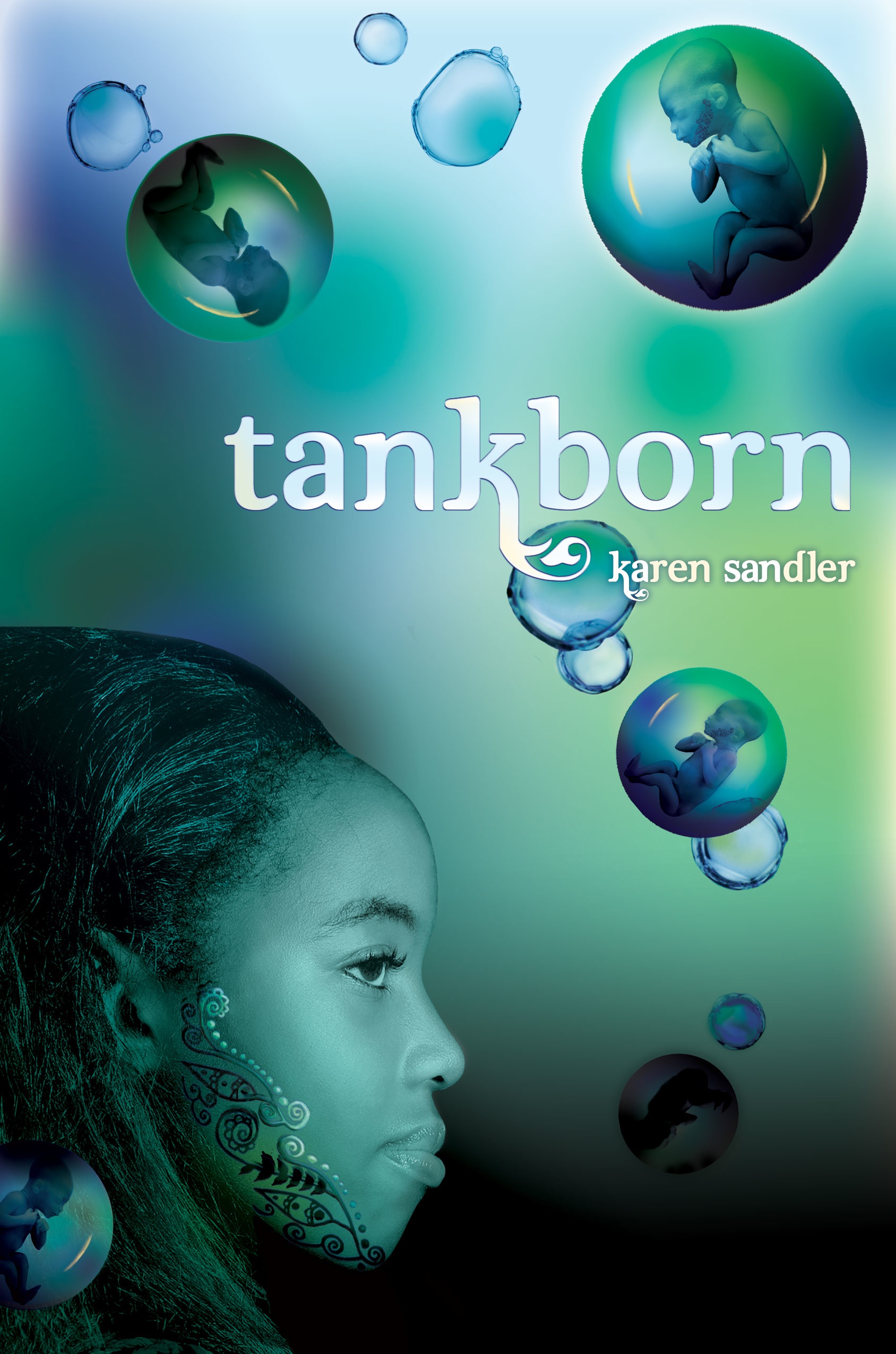
    All along, I also indulged my writing obsession. I wrote plenty of science fiction short stories (my first baby steps along the path to writing my YA novel, TANKBORN). I also enjoyed writing sonnets (yes, really). My preferred form was Shakespearean, fourteen lines, iambic pentameter, a-b-a-b, c-d-c-d, e-f-e-f, g-g rhyme scheme.

    Then I discovered acrostic sonnets. Azimov’s Science Fiction magazine had a contest for best acrostic sonnet and although I’d missed the deadline for entry, I got hooked on writing the devilish things.

    So, what’s an acrostic sonnet? Start with a 14-letter word, phrase, proper name, then use the letters of the word/phrase/name to start each line of the sonnet. The sonnet itself should have something to do with the word/phrase/name.

    So, what did I write about? The nerdy stuff I was studying in school. QUEUEING THEORY and QUANTUM PHYSICS. Also a couple of Trek-related tries.

    I bring this up because I learned over the weekend from fellow writer Greg Pincus about Fibonacci poems. They’re based on Fibonacci numbers, which start with 0 & 1, then proceed from there with subsequent numbers equal to the sum of the two previous. Therefore, after 0 & 1 come 1 (=0+1), 2 (=1+1), 3 (=1+2), 5 (=2+3), 8(=3+5), 13(=5+8), 21(=8+13), etc. The poems are written using 1 syllable in the first line, 1 in the second, two in the third, three in the fourth line, five in the sixth line and on and on. I guess if the poem goes on long enough, you’ll get some pretty long lines.

    So, I could have just written some Fibonacci poems, right? I’ve written plenty of decent, self-respecting poetry. This would be a fun, new form.

    But no-o-o. I had to notice that “Fibonacci Poems” has 14 letters. The exact number needed for an acrostic sonnet.

    I was doomed. My obsession took over.

    So, here it is. My newest acrostic sonnet. My apologies to Greg and fans of Fibonacci poetry everywhere.

    First, I should say I studied math in school.
    In fact, I’m what you’d likely call a nerd
    Because I think that calculus is cool.
    Oh, I can integrate x to the 3rd.
    Now, though, I write. Equations have become
    A sentence on the page. And x and y
    Combine to make a word, and not a sum,
    Creating stories, no more graphing lines.
    I’ve heard there is a certain kind of verse
    Prepared by counting syllables from one
    One, two, then three, then five…it’s somewhat terse,
    Embracing sequences and number fun.
    Most people may not like to do their math,
    So poetry can trick them down that path.

  • If Only They Pooped $$$

    Owning a horse has been a glorious dream of mine since I was a wee thing. More than one Christmas I asked my parents for a pony. Christmas morning, with a heart full of hope, I’d race out to the back yard and search for that beautiful steed I longed for. No dice. The closest I got to my dream was a collection of Breyer horses.

    It was decades before I could buy that equine o’ mine. I had to grow up and marry a really nice guy who not only earns a decent living, but actually is okay with me spending so much of his hard earned cash on a hobby he has no interest in pursuing himself. We also had to move away from L.A. to an area where facilities to keep a horse were plentiful and merely rather expensive as opposed to heart-stoppingly outrageous.

    Financially, I would have been much better off if I’d kept the Breyers (which have increased in value) and skipped the full-size, live-action equivalent (which sucks up lucre faster than a shop-vac). How expensive is it to keep a horse? Take the money you have in your bank account. Multiply by two. Add in whatever take home pay the government lets you keep. Throw in those quarters you just found in the sofa cushions. You’re half-way there.

    Buying the horse itself is the cheap part, and in some ways the easiest. You can always find someone’s back yard “pet” they’re willing to part with for only a couple thousand. Of course, there’s a reason they’re selling so cheap, and I learned the hard way a whole textbook full of reasons.

    My first horse was a supposed “beginner friendly” mare who reared (with me riding). It took a lot of work and a huge loss to sell her on down the road. I lucked out with couple of nice geldings next (Rudy and Ben), although Ben was probably ten years older than advertised. I took a chance on another mare next (the fearsome Georgie), who took off like a bat-outta-hell at every opportunity. Bye-bye Georgie.

    Next came Indy, a wonderful Morgan gelding who put the fun back into riding for me. I swore off mares forever. Then Indy got a little hitch in his git-along and I had to retire him. And wouldn’t you know it–the next horse I fell in love with was a mare. Beautiful Belle, who occasionally takes off like a much more lackadaisical, less committed bat-outta-hell. What is it with mares and running off?

    I do enjoy her, but just standing around in her stall, she costs me bucks (the paper folding type, not the kick up her heels kind). Besides the obvious room and board, there are feet to trim and shoe, maintenance items like wormer, vaccinations and bi-monthly Legend shots (which keep her joints moving). There’s the expense of tack (the cost of saddles alone is enough to make you swoon), fly masks in summer and horse blankets in winter. There are treats (Belle loves her treats). Then of course, when I do finally climb on, there are the weekly riding lessons during which I valiantly strive to counteract age and gravity to look graceful in the saddle.

    All to fulfill a dream. Yes, I love it. I’m grateful to have the opportunity to own and ride a horse. But if only once in a while I could find a twenty or two in those steaming piles of manure.


  • We Have a Cover

    Just a short post to announce that I can now reveal the cover art for TANKBORN, my dystopian young adult novel that will be coming out in September 2011 from Lee & Low’s new YA/MG imprint, Tu Books. Lee & Low announced the three launch books on their Open Books blog. You can check out the cover there, or hop on over to my website (where this blog also appears) for a slightly larger version. The blurb for the book is on my booklist page.

    I’m so excited about my cover. I think it looks great. There’s one kind of cool-creepy aspect to the image. If you look closely at it (you’ll have to examine the larger one that’s on my site) you’ll see the floating babies have tattoos on their cheeks that match the one on the heroine, Kayla’s, face. You’ll have to read the book to find out what that’s all about.

    So please check it out and tell me what you think!

  • When Japan is Right Next Door

    Let me say right at the outset that I hate earthquakes. They scare the crap out of me. Just my luck to grow up in Southern California, one of the earthquake capitals of the world.

    There are three in particular I remember. First, the San Fernando quake in 1971. My two older sisters and I were way underage, but one of them had hidden a bottle of booze in a dresser drawer. After the quake stopped, they both went running for the dresser, worried that the bottle might have broken.

    The Whittier Narrows quake in 1987 happened while I was driving, so I didn’t feel it. I do recall riding out an aftershock gripping my younger son’s crib while the house shook. No fun for me, but my husband thought it was cool. Crazy guy likes earthquakes.

    The Loma Prieta quake in 1989 was the worst of them all. No, that one wasn’t in Los Angeles. Its epicenter was up in the Bay Area. A double decker section of Interstate 880 collapsed, trapping hundreds. A section of the Bay Bridge also collapsed, although overall the damage wasn’t as bad as on I-880. Even so, I still get uneasy driving the Bay Bridge into San Francisco, not to mention the realization I’m driving into earthquake country.

    When we moved to Northern California (thankfully before the Northridge quake in 1994), we settled in a wonderfully seismically stable area. Yes, we contend with wildfires in the summer, but at least the earth doesn’t move.

    Japan is more than 5000 miles away from me. I’m well inland, so the tsunami that followed the earthquake had no impact on me. But I have a connection to Japan that makes the events there seem very personal. My older son lives in Osaka and teaches English there.

    That’s Eric on the left with his friends Yusuke and Kae. Living in Japan was a dream of Eric’s since junior high, but I admit I passed it off as one of those things kids think they want to do but gets cast by the wayside when they grow up. But he never gave up on that dream and worked very hard to make it come true. He spent the last year and a half attending a Japanese language school and now is staying one more year in Osaka to teach English.

    Skyping with him every week, hearing his stories of the neighborhood, seeing his pictures, hearing about the food he’s eaten and the temples he’s visited makes Japan seem much more real than just a country drawn on a map. We even stayed up until midnight one night so we could meet some of the people he works with and a couple of the kids he teaches. We spent most of the time on Skype laughing and smiling. It was clear they like my son very much.

    So when a terrible event like the earthquake and tsunami happens, it hits hard. Yes, I’m grateful my son is safe in Osaka. But my prayers are with everyone in Japan, to those affected by the earthquake, those who have lost loved ones, those working hard to save others. God’s blessings to them all.

    Click for the American Red Cross.

  • Website Adventures

    I recently launched a brand-new version of my site, www.karensandler.net. As an author who’s undergone a genre change from adult romance to young adult fiction, I needed a new look for my site that would better represent who I now am as an author. Since my first YA, Tankborn, is dystopian science fiction, I wanted some really cool SF/fantasy art for my site.

    I have little artistic talent myself (hey, I’m a writer, I use 1000 words, not a picture), so I knew I wasn’t going to be the one to draw the art for my site. Not entirely sure what I wanted, I perused several stock art sites. But I couldn’t find anything that looked right. I next checked out the websites of other YA authors, to see what I liked and didn’t like. Scott Westerfeld‘s site, for instance, is very cool and along the lines of what I was looking for. I tried to figure out his artist’s name, but couldn’t find it.

    So I turned to Google, using search terms such as “fantasy art” and “science fiction art” in hopes of stumbling across an artist I liked. Not much luck there. I found tons of artwork, much of it quite nice, but it either didn’t match that amorphous image in my head, or if I did fall in love with their art, they were big, big names, and there was no way they would be willing to do my little old website.

    I put out calls on a couple of my writer lists for a fantasy/SF artist and finally hit paydirt. An author e-mailed me with the name and website of a new artist, Matthew Leese. I checked out the portfolio Matt had posted on his site and discovered that his style matched beautifully with my still somewhat cloudy vision.

    After some back and forth, Matt and I signed a contract. I pointed out the sites I liked as examples. I told him what I was pretty certain of: that I wanted a cool masthead across the top, reminiscent of Scott Westerfeld’s (but different :-)), I wanted a DNA strand in which the links would be incorporated, and I wanted to use the GEN tattoo design on the page. (GEN=Genetically Engineered Non-human).

    He began by drawing me some rough sketches that included possible fonts:

    Much back and forth ensued during which we considered the font suggestions. I voiced my extreme dislike of mixed-case fonts (for example in the first font, the “n” is lower-case when all the other letters are upper-case). Matt said if I found a font I otherwise liked, he’d fix the mixed-case problem.

    There was also much discussion about what the GEN tattoos should look like. There was a parallel discussion with Stacy Whitman, my editor at Lee and Low,  since the tattoo would also be featured on Tankborn‘s cover. There was no way to make the website and cover versions identical since Matt didn’t have the cover to refer to. But I wanted a similar design. Stacy and I settled on henna-type designs and I relayed that to Matt. He sent his next rough sketch:

    Here is where the fogginess of my vision caused a wee bit of trouble. You’ll notice the DNA devolves into a sort of creature at the bottom of the page. That’s because I had this cockamamie notion that I would try to incorporate elements from another book series I’m working on, one that isn’t finished, let alone published. Bad idea. But Matt dutifully did what I’d asked. It took me several iterations before I finally pulled the plug on the hybrid site concept.

    After zeroing in on the desired font and font color, Matt sent me his next sketches, this time in color:

    Now we were getting closer to the final design and I was starting to see my vision made real. The DNA is also closer to its final version in the second drawing. I’d been pulling in my husband all along (he was going to be my webmaster, the one responsible for actually programming everything). His concern with these sketches was that having the links above my name might make them harder to see (since they’d have the buildings as a backdrop). Also, they’d cover up some nice artwork. I agreed, so Matt’s next sketch incorporated that change:

    In addition to finishing the Hindu-style temple, Matt filled in some henna designs on either side. It’s not the final representation of the GEN tattoo, but it’s getting closer. Also, the background on either side of the temple still needs to be finished. But it’s looking very cool.

    It took a half-dozen more iterations back and forth, minor tweaks and clarification of misunderstandings. Turns out I’m not only not much of an artist, I’m pretty poor at communicating an artistic concept. Matt would draw exactly what I’d asked for, then I’d realize when I saw it that what I’d asked him to do was not at all what I wanted. My apologies, Matt.

    In the end, I have a gorgeous website. I’m thrilled with the final result. I’d love to have you visit and leave a comment letting me know what you think.